
I’ve become mildly obsessed with how compression algorithms of various stripes work over the past year. They really do make every bit of our modern computing existence work so smoothly, from gzipping packet data to speed up slow connections to storing vast archives of high quality music on flash drives the size of a ChapStick. Some simply rearrange the data in clever ways, and others take advantage of our weak eyes and ears to throw out 90% of what was once there–and we hardly notice.
Of the lot, the humble PNG is so ubiquitous, it might not even warrant mentioning. Every format has some magic up its sleeve, however, and in the case of PNG, the way they’re encoded usually makes it possible to shrink them after the fact to the tune of up to a few megabytes with no loss in quality. If you make sites, you might wanna take notes.
I recently decided to run a battery of tests to determine just how well PNG works, on what, and what optimizes the best. I’ll give you the rundown on how it works (in-depth but no math, no worries), and then I’ll give you some hard data and lovely charts to peek at, and finally, show you how to get smaller, lighter PNGs at home, no tricks, no catches.
Losing much without losing a thing
Raw digital data is highly inefficient. In the context of images, a bitmap is, quite literally, a map of raw pixel data. Even for a canvas with nothing on it, every single pixel is described on its own, totally separate from the rest. Each pixel has what’s called a color depth, which is the number of bits used to describe the color of each pixel. An image with an 8-bit color depth can display a maximum of 255 colors in it, while a 24-bit “true color” image can have pretty much any color imaginable in it–but it’s much bigger. (And 32-bit images have eight bits of “alpha” on top of that, so you can see through each pixel!)
So a quick bit of math shows that a 720p image has 921,600 pixels in it (1280 x 720). At 24-bit color (3 bytes per pixel, remember, 8 bits in a byte), we’d be looking at an image size of 2.76MB despite our canvas having nothing on it. This issue plagues digital audio as well; 16 bits per sample of audio, 44,100 of those samples per second…regardless of if that’s silence or the most chaotic, noisy music possible, that’s not gonna be a tiny file.
This is where compression comes in, and what we’re most interested in today: lossless compression. You see, for media, we tend to deal most in lossy compression–that’s compression where we find some way to split up the data and throw out a ton of it. Lossless compression doesn’t throw out any data–it just simplifies it. This means it looks and sounds identical to what you put into it, and you can get back the original image afterwards, no questions asked.
Problem being, it’s not quite as aggressive–the file can still end up rather large. Still, the fact that we can take that big canvas and shrink it at all with no ill side effects is a magical thing indeed.
Explaining PNG in-depth
Lossless signal (images and audio) compression is usually based around the simple idea of prediction. What that means is that the computer can guess at what the next bit of data will be–and if it’s right, it doesn’t have to store a damn thing. If it does, no problem. We can just store what it got wrong (the error), which is still much smaller than the original pixel data. When the computer goes to decode the image, it just follows its guesses, loads in that error, and the original image remains virtually untouched.
PNG compression works in two stages, the delta filtering stage, and then the DEFLATE stage. Delta filtering is what I just referred to–prediction. The encoder goes line by line in the image and predicts every single pixel using one of five methods, storing only the error of its guess. This is called the filter type, and it determines which pixel the encoder will compare the current one to. This can be either the pixel to the immediate left of the current one (1), the pixel above the current one (2), some bizarre combination of those two (3 and 4), or just storing the raw pixel data (0), which you need to do if you have two pixels with basically no relation to each other–say, a molten red next to a forest green.

Brief aside that’ll be very relevant later: you can either have one filter type for the entire image or a different filter type for each line. One filter type for the whole picture is called fixed filtering, and one per line is called adaptive filtering. Particularly lazy encoders use fixed filtering and all the extra, wasted space that comes with it. Again, I’ll return to this.
Now, the error values are gonna be more similar to each other than the raw pixel values, and that’s important for the second stage, DEFLATE. DEFLATE is actually also what’s used in a lot of ZIP files, and it’s its own two-step process, so stick with me while I explain it. Say you have the word “Appalachian”, and it appears 50 times in a paper. If you’re compressing that paper, you can store the full word “Appalachian” once and then a symbol every other time it appears and reap a ton of space savings in the process. This is called dictionary coding. You store the data once in a dictionary, then use symbols every time it crops up after that. DEFLATE’s particular dictionary coding implementation is called Lempel-Ziv-Storer-Szymanski, or LZSS, compression.
LZSS first involves generating a “sliding window” of up to the last 32KB of data. That window is DEFLATE’s dictionary. If it finds that there’s a repeated chunk of data, it stores a symbol called a length-distance pair–basically a reference that says “go back this number of bits and copy this much data to the current position”. DEFLATE then applies Huffman coding, which is a decently efficient way to store these length-distance pairs. More frequent symbols are given much shorter names than less frequent ones, thus even more space savings.
So getting back to how this ties into PNG, because the error of each of those guessed pixels is much closer to each other than the raw pixel data, DEFLATE works much more efficiently–more opportunities for symbol substitution.
I tried to make that as simple as I could, but to sum up in steps:
- Go line by line and guess every single pixel’s value, left to right, using one of the pixels near it.
- Store whatever wasn’t correct about that guess, the error value.
- Read through the image in chunks, 32KB or less, looking for matching error values.
- When you find one, so you don’t have to say it twice, leave a note about how far back to look for the first error value and to copy it instead.
- Encode those notes so the more common ones (and their distances) are given smaller symbols and less common ones longer symbols.
This is the gist of how PNGs work, and why they’re so efficient on simpler images should come into focus now. If you have an entire row of nothing but white pixels, all you need to do is store the first pixel’s value, predict every other pixel also being white, and then store that as efficiently as possible, and you get what could be a few kilobytes of inefficient, wasted space down to maybe 60 bytes.
Now, of course, there is more to PNG than this. I haven’t touched on interlacing, which is how you can get some kind of image out of a half-loaded PNG, nor animation (which was never official anyway), nor the various chunks for storing things like gamma correction or color profiles (PNG is a container format, after all, not just a way of compressing images), but this essay really isn’t about all that. I wanna talk about getting the smallest images possible.
Where encoders waste space
Now, in the last section, you might’ve wondered how exactly the computer knows which filter type is most optimal at that moment. That’s where things get interesting. Short answer: it doesn’t, nor does it even need to care.
You see, there is no right or wrong answer as far as which filter type to use–a valid PNG is a valid PNG. A lazy encoder doesn’t need to waste time trying to pick between them. Better yet, while each line in a PNG can have an entirely different filter type, there’s no need to. An egregiously bad encoder can simply use the same filter type for everything, even type 0 (the “don’t filter” type), ensuring as few LZSS matches as possible and bloating the hell out of the output PNG. And from the outset, there’s no way to tell.
PNG optimization programs have been around for a while now. Their purpose is to grind away at a PNG, using various heuristics (detection algorithms, essentially) to determine the most efficient way to filter each line and search for LZSS matches. This essentially undoes the damage that a lazy PNG encoder does, producing a file that’s anywhere from 30-90% the original size without any quality loss.
There’s no exact science to PNG optimization; hell, picking the best filter type is occasionally closer to occultism than science, but we have a pretty good idea of how to do it. Simply run each filter on the same line and pick the one that produces the fewest error values. Less data and simpler data means more LZSS matches and a smaller file.
If you’re in the website business, you should absolutely be optimizing your PNGs. If you’re building a static site in the first place, you likely care quite a bit about how quickly your page loads, and tons of big, bloated PNGs likely don’t help any. While you can certainly save space using a lossy format, if you’re a picky artiste, you might not want the additional blocking and ringing that comes with any quality JPEG. Thus, an optimized PNG (and perhaps a reduction in each image’s dimensions) is a good middle ground.
What PNG optimization can do for you
Time for the fun part: the tests. I’ve been optimizing PNGs on my own for a while, so I knew roughly how much I could save with most images, but I wanted to see just how much a difference optimized PNGs could make in the aggregate across a larger set of images.
I had just the perfect set of input data too: 300MB of unoptimized Caby art, saved using her two main art programs, generally speaking, Medibang and Clip Studio Paint. Some are paintings, some sketches, some pixel art, and some are just clean, solid digital art. In short: perfect for seeing which images an optimizer works best on.

For the tests, I of course went with my main PNG optimizer, PNGGauntlet. PNGGauntlet combines three other PNG optimizers into one, pngcrush, optipng, and DeflOpt. It produces about the best PNGs you’ll get. I ran it on each of the folders in the archive, marked down the size of the folders before, the size after, and which image in each batch compressed the best and by how much.
Right! Data!
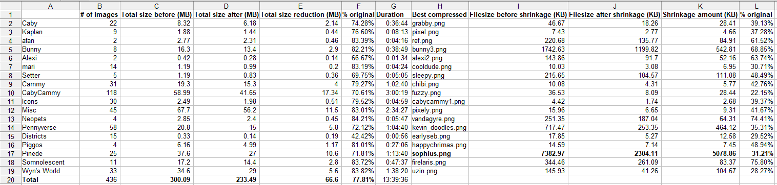
So to sum up: in the aggregate, you can reduce the size of your PNGs to about 80% of their original size, rounding up. In total, that 300MB went down to 233MB, and in many cases, you can achieve much, much better optimization ratios. One particular outlier, the originally-7.3MB sophius.png (I’ll show the images I reference in a moment), shrunk to only 2.3MB after optimization–about 31% of the original size, or a 5.1MB difference.
Let’s get to some graphs for color:

Having as much data as this got me curious about some of the scenarios the optimizer performed better and worse in–and of course, the rather absurd length of time it took overall. (PNGGauntlet keeps track of the time it grinds away in its status bar with fairly good accuracy.) Some of my conclusions are are follows:
Most ideal: smaller images, fewer colors, sharper areas of color
Let’s start with the stuff that’ll surprise nobody. The stuff that the PNG optimizer was able to squish the best were either sketches (which are usually in greyscale, and if not, paletted thanks to their few colors), pixel art, or very sharp digital art. The larger the image was in dimensions, the less efficient the compression was overall.

Art style often correlates to folder simply because of changes in what and how Caby was drawing. Early this year, she switched to both a much softer, painterly style and much larger canvasses. Therefore, despite Bunny existing for much less time than Caby and having much fewer pieces total, Bunny coincides with that change in style, and her pieces are much larger and less easily compressed as a result. Caby’s art tends to be sketches and older, flat digital pieces, thus the better optimization ratio than Bunny.
The Districts art is some of the oldest I’ve got from her, and while it was never particularly big in the first place, it had far and away the best optimization ratio, down closer to 40% for the entire batch, while the closest one to it is Alexi‘s art, at around 65% overall.
Meanwhile, the group art and her Wyn‘s World art both tend to be much bigger, softer, painted pieces. In fact, there’s not one single monochrome sketch in the Wyn’s World folder, but there are 16 fully finished pieces with a background, most leaning on the large side. Thus, it had one of the worst optimization ratios of the entire bunch, at just shy of 85%.
Optimization ratios aren’t everything
One of the unfortunate realities of gathering data is that if you don’t have like things, you can’t compare like things. There’s no metric by which I can show you this point on a chart, but basically, the stuff the had the best ratio tended to be pictures that were already small to begin with. Meanwhile, while the bigger pictures optimized much worse, even smaller gains had a fairly big impact.

Two of the images that optimized the best in their respective bunch were bunny3.png (which is a sketchpage of various Bunnys, natch), and sophius.png, which is the Sophius she drew to finish off Art Fight! 2020. bunny3.png had a fairly good optimization ratio already, at 69%, but given that the original piece was around 1.7MB, that meant over 500KB in total was shaved off the image size. Plenty of the larger (>2MB) images had fairly poor optimization ratios (~80%), but that still meant a reduction of several hundred kilobytes.
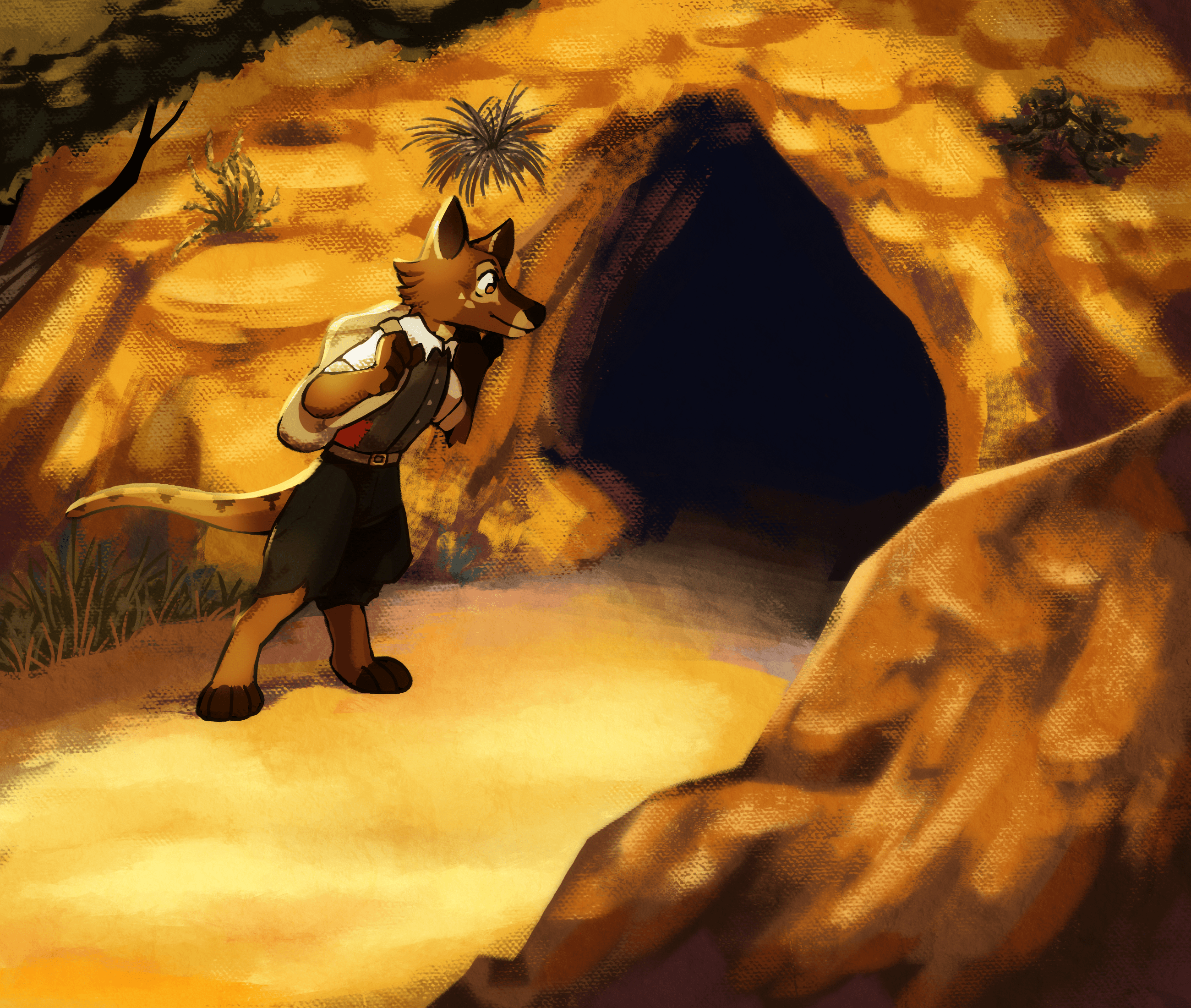
sophius.png is an even more absurd reduction, and demonstrates handily how lazy PNG encoders can be. The original image, though big and painterly, was not 7.3MB big. Though optimization took forever, the file shrunk to 2.3MB, saving 5MB in the process.
Compare these to one of the images with the best optimization ratio, cooldude.png for mari. 30% optimization looks fairly impressive…but even unoptimized, the original image was only 10KB.

In short, while larger images take longer, the space savings are generally far more worth it, all things being equal.
Reducing the color depth helps massively
I’ve been withholding one singular detail from you about that Sophius drawing and why it compressed so well. And admittedly, I would’ve never known had I not gone digging for a pre-optimized version of it.
You see, the 7.3MB version of the image was actually not the true original, simply the one I had saved. When I went to Caby’s Art Fight! Trello to retrieve a copy of the original, I noticed it was a good bit bigger than my copy ever was–8.5MB. Worse still, when I went to optimize it, I wasn’t getting nearly the space savings I got before. I went around a bit, comparing image details until I noticed one singular bit of information on the optimized copy.

8BPP.
You see, in order to get the gigantic image to post on Discord, which has an 8MB file size limit without handing them money, Caby used a PNG optimization site called compresspng.com that worked quickly, but actually damaged the original image by lowering the color depth. At 8BPP, the image has to rely on a very limited palette of colors and dither out what it can’t display as a proper color. This 8BPP version was what I had saved (and what was featured above), and I hadn’t even noticed the dithering because of the image size. Naturally, PNGGauntlet worked much better on the 8BPP version than the 24BPP version–more repetition in the colors.
So in short, in a hurry to get this gigantic file to post places, Caby used a site that indeed made the image smaller…by getting rid of most of the colors. As for why the it was still so big even after that? Well, it reduced the color depth and then saved it as 24BPP anyway. Not exactly the most efficient thing, is it? Thus, when PNGGauntlet made it a proper 8BPP PNG, it reaped the full benefit of that color depth reduction.
As such, reducing the color depth of the image is another option if you need to shrink a PNG without reducing its size, though be warned about the dithering artifacts. (Personally, I think dithering is less damaging to the original piece compared to JPEG’s blocking artifacts, but that call’s up to you ultimately.)
Taller images optimize better
Images that are distinctly taller than they are wide on average compress much better than other pictures. Two of the images among the best optimized were time.png (which isn’t listed because I squashed down my various CabyCammy art folders into one for this blog post, but it had a 23% optimization ratio, going from 40KB down to only 9KB) and earlyseb.png (at 30%, from 18KB to 5KB), both of which are taller than they are wide.

This is one I wasn’t expecting, but it makes perfect sense. Remember that adaptive filtering I was referring to? More lines means the optimizer has more opportunities to vary how each line is filtered. I’m not saying it makes the most difference, but it definitely has some kinda effect on the overall filtering.
I’ve also heard that if a single line fits within the LZSS sliding window, it’s more likely to find matches, whereas if a single line doesn’t (even slightly too wide), those matches aren’t found and the image compresses noticeably worse. This has more a bearing on images that have a width over a certain amount in the first place, really, but still interesting to note.
Only the size in aggregate matters
Here’s a curious question. What optimizes faster, 18MB of 30 pictures or 18MB of ten pictures? I thought the former would optimize faster, as the file sizes would be bigger on average in the latter’s case. Bigger files are naturally where the optimizer grinds the longest, and I was expecting it to be a exponential increase in duration. In other words, I expected one 4MB picture to take much longer than eight 500KB pictures.
Answer is, surprisingly, they optimize just as fast! The mari and Setter folders were both 1.19MB in size, the former with 14 images and the latter with only five. There was a 30 second difference between the two. The afan folder with a measly two images was roughly the same size as the folder of our matching icons, with 30 images, and again were 30 seconds off from one another.
So essentially, the big thing that controls for the speed of the process is the overall size of the entire batch. The amount of files doesn’t change a thing.
Optimization isn’t fast
This is the elephant in the room. In total, while most folders didn’t take more than an hour to optimize, some took an hour or longer, and the process overall took an assrending 13-and-a-half hours. No doubt this is based on processor speed (and I’m using a six year old computer, so I’m sure a similar modern machine or professional-level hardware would do much better) and also the fact that I was running the optimizations on a decidedly not speedy flash drive (USB 3.0 my ass). Still, it’s not a quick process.
Of course, it makes sense why it’s not a fast process. PNG optimizers are essentially artisan encoders, working with every tool in their arsenal to get the smallest file possible. If you don’t care about the space savings, any PNG encoder will do, but if you’re trying to distribute files over the Internet, or save space on a smaller volume, then the time to optimize is a more than fair tradeoff. Simply load the images into the optimizer and go take a shower.
Of course, that also begs the question of “if it’s not ideal, should you use PNG?”. That really depends on your use case. If artifact-free files are what you’re after, or if you’re doing sharp linework, pixel art, or working with UI elements, then yes, there really is no other alternative and you should be optimizing everything you see necessary. Even the most optimized PNG loses out to a high-quality JPEG, however, so if you’re working with smooth, soft-toned images and size is the utmost concern, JPEG naturally performs the best.
This has been an incredibly long post, but compression is a complete rabbit hole, filled with many basic ideas implemented in many unique and curious ways. The fact that someone always finds a way to rewrite data to make it easier to store and compress, no matter the intention, is underappreciated. We wouldn’t have video and audio chat, streaming media, any post-LaserDisc video-on-disc format, virtually any kind of inline Web multimedia, or any number of other small consumer innovations without the intense gains these compression formats give us.
What makes PNG special to me is that the compression can be reapplied to majorly save space without a single upgrade to the technology. No other format to my knowledge has anything similar; lossy algorithms like MP3 and JPEG can make smaller files, but with major drops in perceived quality. Other lossless algorithms like FLAC have a nominal way to increase compression (using “levels”), but these save very little space and by and large just make the file harder to decode.
If you’re interested in trying out a PNG optimizer on your own images, I would highly recommend not using an optimizer site. Just from what I’ve seen of compresspng.com, I don’t know what method any of them use, but damaging the image without giving users the option is a huge no in my book. Seek out some kind of downloadable binary; again, on Windows, PNGGauntlet is my go-to, and pngquant looks curious too. Perhaps you can try a bunch out and let me know what gets you the best results.
I’d also recommend checking out the official libpng site that I linked in the intro. No fancy, overcooked site designs here–just tons of history, implementations, example and test images (including that lovely old-school 3D logo), and even screenshots of how WebTV did PNG, if you’re into such things like I am.
So I could check back on every image’s individual space savings if I needed to, I took screenshots of PNGGauntlet after every single folder was finished. I suppose it’s only poetic (and a little extra useful information, showing you how it works on various screenshots) to end off with the shot of PNGGauntlet optimizing all those PNGs too.

optimization nation