
We like to redesign our sites from time to time, and earlier this year, the top-level domain got its turn. The previous design came in the spring of 2020 and featured a rotating crop of big, toony banners at the top of each page that would show up either year-round or seasonally.
While we gave up on that site design, we’re still very fond of the banners. Obviously, they’re no longer featured on the top-level site. That’s a lot of art and a lot of work going to waste! While we’d like to reuse them in another design, for now, this post will have to do.
Being a longtime reader of the Video Game Critic, I decided to take a page out of his book (or off his site, maybe?) and not just write up a bit on my thoughts on each banner, but get the people who made them to tell their stories about each one. (Click the images to see the banners in their full size; without shrinking them, this page would be over 5MB big!)
Year-round banners (arranged alphabetically):
“Cops”

Caby: This banner was based on the idea that Cammy and marf represent two sides of Cameron, his softer side and his more snarky side. And thus good cop/bad cop duo Cammy and marf was born,, The general style of the piece was maybe a little bit noir-esque, though I was mostly fixating on drawing a strong light source coming from that lamp to imitate one of those dramatically lit interrogation scenes.
Cammy: The idea here was all Caby’s, despite featuring two of my sonas. Cammy cleans up surprisingly well in a dress shirt, despite the crazy hair.
“Mains”

dcb: Yep! So this picture was taken while I was replacing the power supply of an HP Media Center PC from a family member. Although some frustration came with removing the hard drive due to some tight screw placement, the project turned out a good success. I was a big fan of the “Inside Your Computer” theme on Windows 98 as a kid, and the banner reminds me a lot of it. It sells the wonder and charm in how the machine comes together.
Caby: From what I remember, this was a cool photo dcb took of the internals on a PC. I thought it would make for a neat banner. I think it looks a lot like a miniature city in a way. The amber colouring was done on a whim, but it ended up suiting nicely. Makes it look like an old amber CRT.
Cammy: I think I remember us trying different colored versions of this one, but the yellow won out. We’re big believers in technology being very warm and very imperfect. There’s nothing more imperfect than 90s PCs.
“Pinede”

Caby: The story behind this one was very simple. We had no Pinede banners! So I had to go ahead and make one,, With one of my favourite lads, of course. The watercolour style was chosen because I was really into playing with that at the time, and I thought it would both suit the general aesthetic of Pinede, but also the “traditional art scanned in” look that was much more common back when fantasy furs were all the rage online,,,
Cammy: I remember Caby was just in love with this lil guy when she came up with him. His name’s Fintan, here’s his toyhou.se profile. I can’t argue; red squirrels are great! I think the banners are so ideal for letting her show off all her various art styles–in this one, a more textured, watercolor sorta look.
“Quake”

Cammy: Gosh, I guess I made this one! This one was actually modified from the banner on the original somnol.net site, from 2018. I wanted to lean into the “cult” thing and, in a level editor for Quake, I quickly built a weird temple room with a bulb at the end of the walkway–over a pool of blood. We were nostalgic for it, so I brought it back as a banner (though with the blood cropped out by circumstance, bah). The posterization was meant to simulate the crunchy look of Quake in software rendering.
Caby: Listen, I’m always happy to see someone else make a banner! I enjoy the lighting on this one, super moody, as Quake tends to do well~
“Somnol”


Caby: I was big into these really sharp, monochrome early webcomics and I wanted to take a bit of inspiration from that sorta style. Figuring out ways to make everyone look suitably cartoony but still recognisable was a fun challenge. I think I originally intended to colour it fully, but it looked neater with a flat colour.
Cammy: This was one of the first banners I think Caby came up with for the redesign. I wanted to give folks with JavaScript disabled their own, unique versions of some of the randomized images, and actually, the early prototype version of the heads banner fit the bill. Try it for yourself. Disable JavaScript for archives and reload the front page. You’ll see us in yellow instead!
“Stony” and “Stony II”


Caby: Photos of an old ruin in Margam Park! It was a lovely sunny day and I love to take photos of stuff contrasting strongly with a bright blue sky. Later on while brainstorming banner ideas, I decided they’d be good for that too, and added some little text and texture for flavour.
Cammy: These two were meant to be seasonal, but since Wales is so mild year-round, they really didn’t remind us of a specific time of year. The somnolescent.net written along the wall in the statue one reminds me a lot of some [adult swim] bumpers. Those guys had STYLE.
Seasonal banners (arranged by time of year):
“Medicine” (Winter – displayed during January and February)

dcb: I took this photo on a chilly New Year’s Eve 2020, during one of my regular photowalks in that period of time. In Minnesota’s colder months, the lakes freeze over and people camp out for ice fishing. For the banner, I warmed the image a bit, added noise to taste and wrote the text in myself. Very pleased with it.
Caby: Again, happy to see other people making cool banners! I love the handwritten text on this one, and the general composition, cool stuff.
Cammy: The rolling, driftless north continues to be both rolling and driftless. And perhaps northern.
“Garden” (Spring and Summer – displayed from March until August)


Caby: One of the earlier banners! Drawn fairly early on, not too long after we decided Penny should have a love of slightly abnormal gardening,,, I still like the colours in this, everything soaked in the green light reflecting off the various plants,,
Cammy: This was one that always made me happy when it came back up in the rotation. Means warmer weather’s on its way! It’s also the only banner that would be edited later on, as Penny became a calico and thus needed a recolor.
“Daf” (Summer – displayed during June, July, and August)

Caby: Wyn and Daf, always a pleasure to draw them,, I had the image for this one in my head and it took a little bit to actually fit it into the banner, I remember. Daf’s not a regular smoker, I can tell you that much,,,
Cammy: The first of two Wyn banners! Daf can totally drop the cool shtick any time he wants. It’s not working and they’re the only ones out here anyway.
“Painting” (Summer – displayed during June, July, and August)

Caby: This was a full drawing that I simply cropped and added the URL to! Of our resident old, artsy gay couple, Riley and Giulio. We should probably link the full piece somewhere :]
Cammy: Ask and ye shall receive. I love easy banners. I mean, I guess for me, they’re all easy since I didn’t make any of them. But I mean in general.
“Camping” (Fall – displayed during September, October, and November)

Caby: Another one of those “oh man I need to draw that” moments, of a cosy little camping trip with a cool, purple background and the site name written in flames, because that’s freaking cool. Still one I’m very proud of, funnily enough the most challenging part was writing out the text…
Cammy: This was a really late addition to the rotation, I think in 2021. The fact that everyone’s so warmly dressed isn’t an accident–I have been outside in November in Pennsylvania in 60F weather with only a light jacket on and been fine. The climate be kinda wacky, yo.
“Wyn” (Fall – displayed during September, October, and November)

Caby: This one actually started out with just the window. I liked the idea of having the name of the site written out like someone had painted it into steam on glass. I then needed a reason for the glass to be all steamed up, and a cat boy with a warm mug of cocoa seemed to fit the bill,,,
Cammy: I love the colors and how comfortable this one looks, though Wyn’s eyes are piercing and it freaks me out a little. Especially since they’re red and all. Can someone check on that boy and make sure he’s still in this plane of existence?
“Boo” (Halloween – displayed during October)

Caby: I freaking love Halloween, even though it’s barely celebrated over here. I absolutely wanted to draw something for it, and two of the youngsters in Apricot Bay, Colton and Madeleine, going trick-or-treating seemed like the perfect idea for a banner. I like to imagine Colton’s the type to get really into character whenever he dresses up. I also added some fuzz and an attempt at VHS glitches, an ode to watching trashy old horror films in October…
Cammy: Y’know, Colton’s suddenly reminding me of The Black Parade here. A solid seven years before that album came out! What a trendsetter.
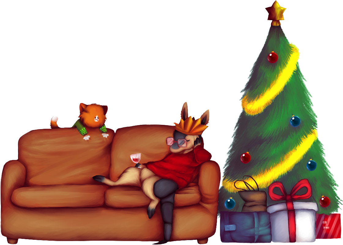
“Wine” (Christmas – displayed during December)

Caby: Was going for a real retro, warm, Christmassy feel with this one, and I didn’t know they didn’t have paper crowns and Christmas crackers in the US when I drew this,,, but it still just screams “festive” to me, so I had to include it. All adults end up drunk and wearing a paper crown during Christmas, it’s the rules. And Seb’s always been one to follow rules… Also to note, Christmas trees are an absolute blast to draw.
Cammy: How a boy in Oregon managed to get the paper crown from a Christmas cracker is something we don’t discuss. I think the black background and the lights and ribbons strewn about give this one a really woozy sense of space, which totally works with Seb being sauced out of his skull. I like it a lot. Something that Caby didn’t mention is that that this is actually a redraw of a very old Pennyverse piece that never got finished!
There are a lot on here that I haven’t even seen before… Stony I+II and Wyn I particularly love, and Daf is a classic. Super expressive.
rotating banners are one of most fun elements in layouts for sure! i always loved them all and it’s hard time picking favorite one. diversity here is great too, good mix of photos and drawings is always neat >>:3c
I’m especially fond of Camping myself. Super neat vibe. Reminds me of the cozy late summer, early fall season. Or, I’m hungry–which is always possible.