I’d kick this off with an introduction to the topic at hand, but its about fucking DeviantArt and if you don’t already know what DeviantArt is than you’re either not that into the artsy scene, not interested in poking fun at the weird shit that comes from it (and you frankly scare me) or you’ve been living under a rock for the last two decades. Ultimately, all you really need to know is that DeviantArt decided to overhaul its website against the will of it’s entire user-base and named it after the funny thing the sun and moon do once and awhile.
So, I never really expected to have any real issue with what DeviantArt was doing outside of “It wasn’t broken so why’d you fix it?”. I looked at it once before it officially dropped, wasn’t impressed, but also didn’t examine it close enough to truly notice how just god fucking awful it was. So, Eclipse drops, opinions change, website sets itself on fire, and I’m writing an essay to explain how shit it is to the best of my ability.
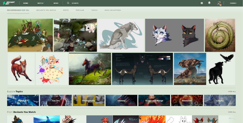
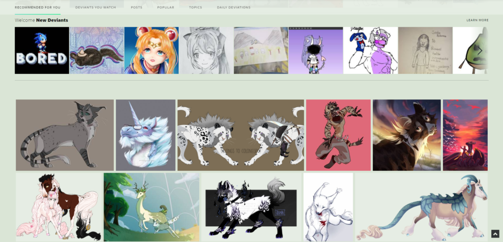
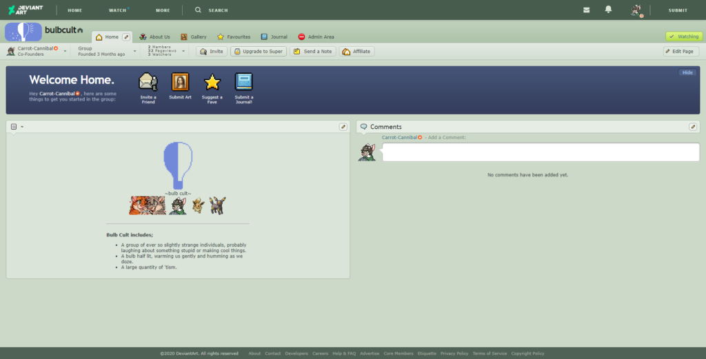
The main page looks significantly different in layout now, with side-scrolling menus and individual categories on one page. While, sure. It’s showing me stuff relatively similar to the kind of stuff I tend to create or even enjoy, I’m feeling more restricted in what I can actually freely come across. It doesn’t cycle through these very much either. I swear I saw some of these same pieces yesterday. My beloved “Newest” section appears to be pretty much gone at this point as well (daily deviations is not a new way to say newest). Damn shame. However, I’m less angry about this fact than I am about the next ones.
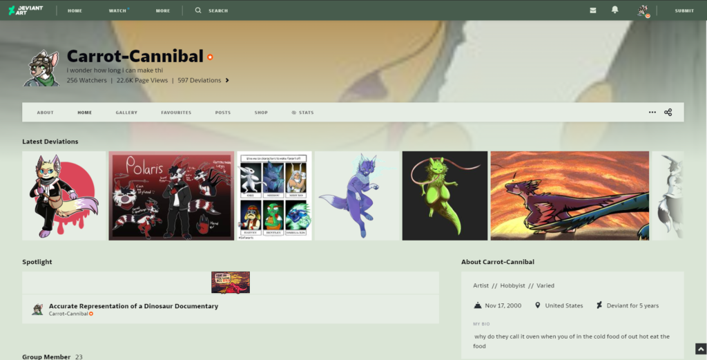
The GODDAMN AESTHETICS of everything. It feels like DeviantArt is trying to be other websites and it’s murdering the unique and dare I even say iconic appearance the website had. This would be just a simple let-down if I actually liked the way the site looks, but I don’t. I think its all just very tacky looking and again, very reminiscent of other sites.
As a nice little segue into what matters more about this change, the actual functionality of the new site, here’s what pages like account settings, groups, earnings, etc. look like in this new layout. EXACTLY THE SAME. THEY DIDN’T UPDATE ALL THESE PAGES WITH THE NEW LAYOUT. FANTASTIC.
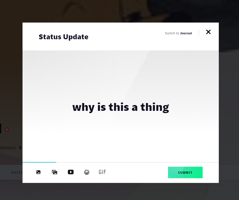
If getting whiplash from two different versions of the same website converging occasionally doesn’t tickle you funny, then perhaps the user unfriendly interface will. Every notification from comments to favorites to the stupid comment likes they added is in the same drop down window, the back button doesn’t fucking go back making rummaging through my feed an absolute nightmare, there’s a meter as you’re typing up a status that doesn’t seem to actually hold much of a real purpose, and this isn’t even scratching the surface. I’ve heard around that organizing one’s favorites and submitting art to groups is a tedious task now and I can believe it.
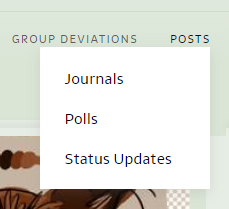
Those are just the really big flaws in the interface. Things like windows and text not being in a convenient, easy-to-understand spot, random quality changes on windows that are so small yet so annoying when you notice them, the weird shrinking and enlarging of icons and text this site really enjoys doing, the list of other quality and interface flaws may as well be endless.
Somehow, they passed this mess as a complete product when it’s clearly not. There are so many problems present on the site and I both probably don’t know them all and don’t have energy, time, or will-power to find and mention each and every one of them. If anything, I encourage you, the reader, to explore, talk around, and find every little horrifying flaw in this interface and hell! Feel free to leave any you find down below! There’s a comment section for a reason and I’d be delighted to see just what terrifying things I and others have yet to know about.

Was on this site for 6 years and I’m pretty sad to see it crash and burn like a drunk teenager driving their mom’s car, but that’s just the moral of this story. Get too cocky and forceful and suddenly everyone’s mad and one is spamming yiff porn at you.
hhahahahaha