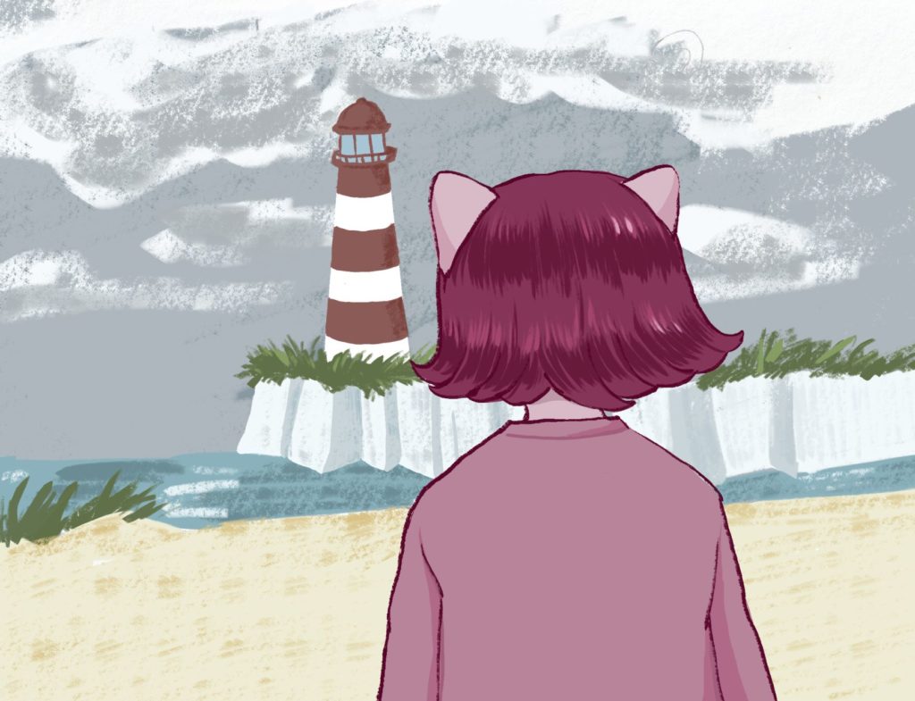
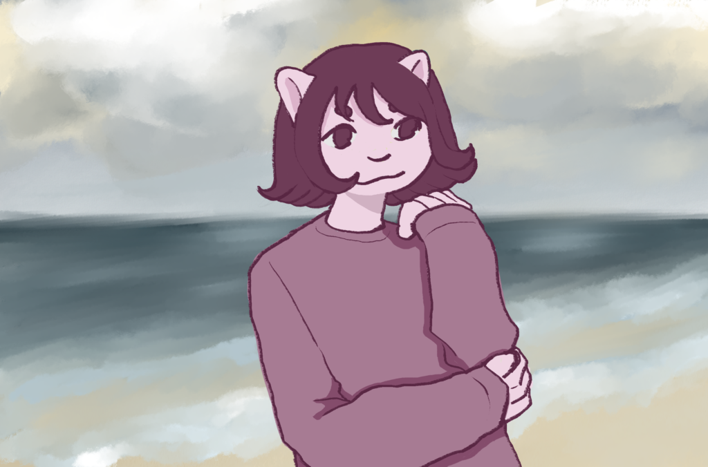
I had both of these pieces posted around for a while already (even using second cat for icon in few places, needed some change,,,) but I still think it’s worth to post them here, also to get finally some reading material for Cammy!
For a good while I didn’t really draw, for myriad of reasons which are pretty usual ones. It sucked a lot, but it finally broke at point where I started thinking about re-designing devon.somnol since it seems to be lackluster for now. Cammy asked me if I’m keeping cats around, honestly at start I wanted to go for a while with matfloor 2.0 design-y intention, but I suddenly got reminded about some of loish’s early websites which utilized illustration in layout. Started figuring what I could use to integrate into layout design so I doodled a Cat on beach, kinda British beach as it was tied with her a lot in my head.

This one started as a pencil sketch I went to finish digitally, basically first take on this idea, though I like it I wouldn’t use it as part of layout. It’s an illustration on it’s own, in the end. Background here was completely from imagination and I wanted to make it lineless and cartoony to contrast with more polished Cat. This lighthouse should be smaller though,,,

Second take, though it was simpler, it started in same way – as a traditional sketch. I found this workflow better while trying to adjust to using more digital in my process. Sketching digitally is hell for me, it gets messy and wonky quickly, lining is slowly less scary for me but I end up hating stuff because it’s just not like my traditional inks. This was a first attempt at proper digital painting and also, first time in ages I looked for some reference,,, I’m surprisingly satisfied with clouds here – initially I thought they are just bad, but after a while it started to look finely.
I like that with these pieces I could try picking colors with less of hassle than using traditional and it was for sure easier to get muted tones I wanted. I do want to make more illustrations like this, I do. Since I found that they are a good way to ease myself into big, nice stuff I want to make but never end doing anyway. Better to start small, for sure.
Bonus:

Have some truly 2002 piece. Traditional inks scanned as usual, but I tried more angular style this time. I actually fired up Photoshop 7 to color it (and removing blue was easier, but removing background? Kinda annoying). I wish that color picker wasn’t so annoying and I didn’t forget about existence of color sliders, which fixed all of my issues.
Painter 8 is nicer.

yesss >:3c
glad to see you writing stuff up again! and these drawings were all lovely to see come together!
digital art is definitely a very different process from traditional, but they both have their strengths and the potential to be fun >>:3c
i really feel that I’m about to do more than I did in past two months, feeling truly motivated after getting out of this slump. with af round the corner, which will help me with finishing my output actually if i push myself to do all of planned attacks (compared to disorganized first year, didn’t really found a lot of lads I actually liked,,,).
it really is different but it got some nice things I prefer more to traditional, but still missing what I like the most about traditional. though i’m going forwards in a good direction, i feel this